Ori Living
Ori is a robotic furniture company that sells expandable furnitures.
Problem:
The name "Ori" came from "Origami". The logo doesn't reflect paper folding and expanding.
Missed opportunity for there's no motion identity. The entire Ori robotic furniture product is based on expanding movement.
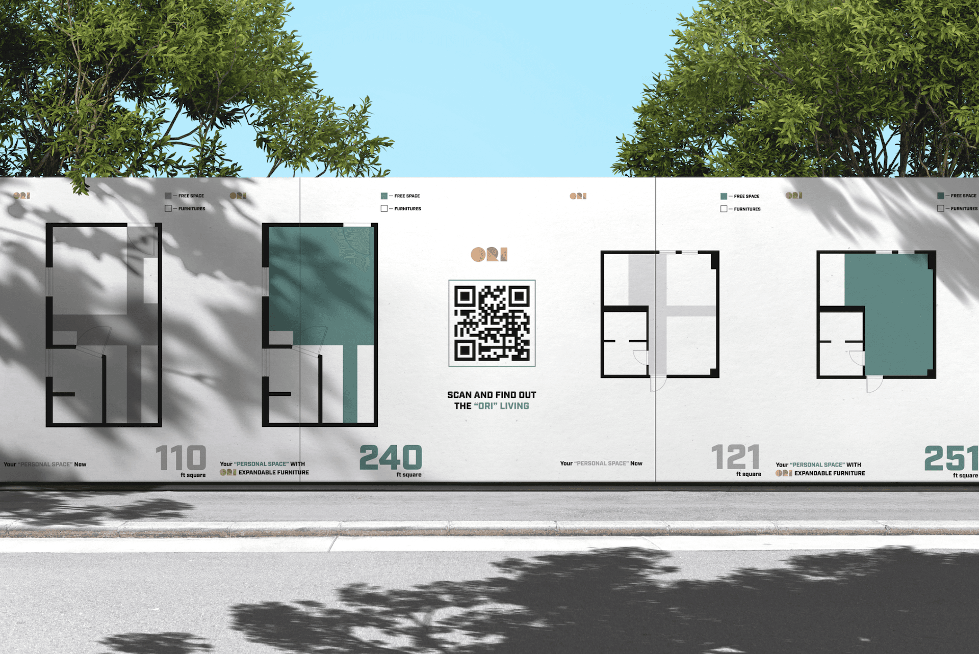
Current design doesn't reflect its unique value proposition: "Expanding spaces to create more room for residents".
Previous color palettes are to technical. A furniture company's color palettes must be home oriented and home friendly.
Solution:
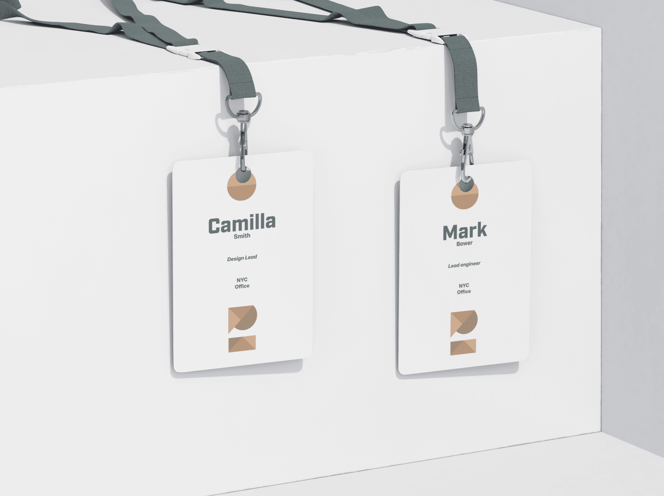
Redesign logo by removing gaps between the shapes and fill each shape with different shades of brown to create a origami visual with wood tone.
Design motion system with expansion and creating spaces in mind.
Must clearly address Ori's UVP: create space for apartments.
Use toned down green and wood-like colors to convey a home friendly identity.


Project Description +